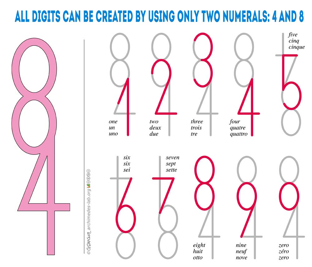
Deebster to 196@lemmy.blahaj.zone • 10 months agoRule 84, etclemmy.mlimagemessage-square44fedilinkarrow-up1325arrow-down10
arrow-up1325arrow-down1imageRule 84, etclemmy.mlDeebster to 196@lemmy.blahaj.zone • 10 months agomessage-square44fedilink
minus-square@revoopy@lemmy.worldlinkfedilink28•10 months agoI argue that when presented with 9 normal looking numbers, the o is not an acceptable alternative to 0
minus-square@miss_brainfart@lemmy.mllinkfedilink8•10 months agoSo many fonts just do whatever to be different and stand out from the crowd, but all it does is making it easier to avoid them
minus-square@AnUnusualRelic@lemmy.worldlinkfedilink1•10 months agoIt just looks like a lowercase 0. Lowercase digits often look better anyway.
minus-square@AnUnusualRelic@lemmy.worldlinkfedilink1•edit-210 months agoLook up lowercase digits in your typography manual and be enlightened. And also start making nicer documents.

I argue that when presented with 9 normal looking numbers, the o is not an acceptable alternative to 0
So many fonts just do whatever to be different and stand out from the crowd, but all it does is making it easier to avoid them
It just looks like a lowercase 0. Lowercase digits often look better anyway.
what
Look up lowercase digits in your typography manual and be enlightened. And also start making nicer documents.