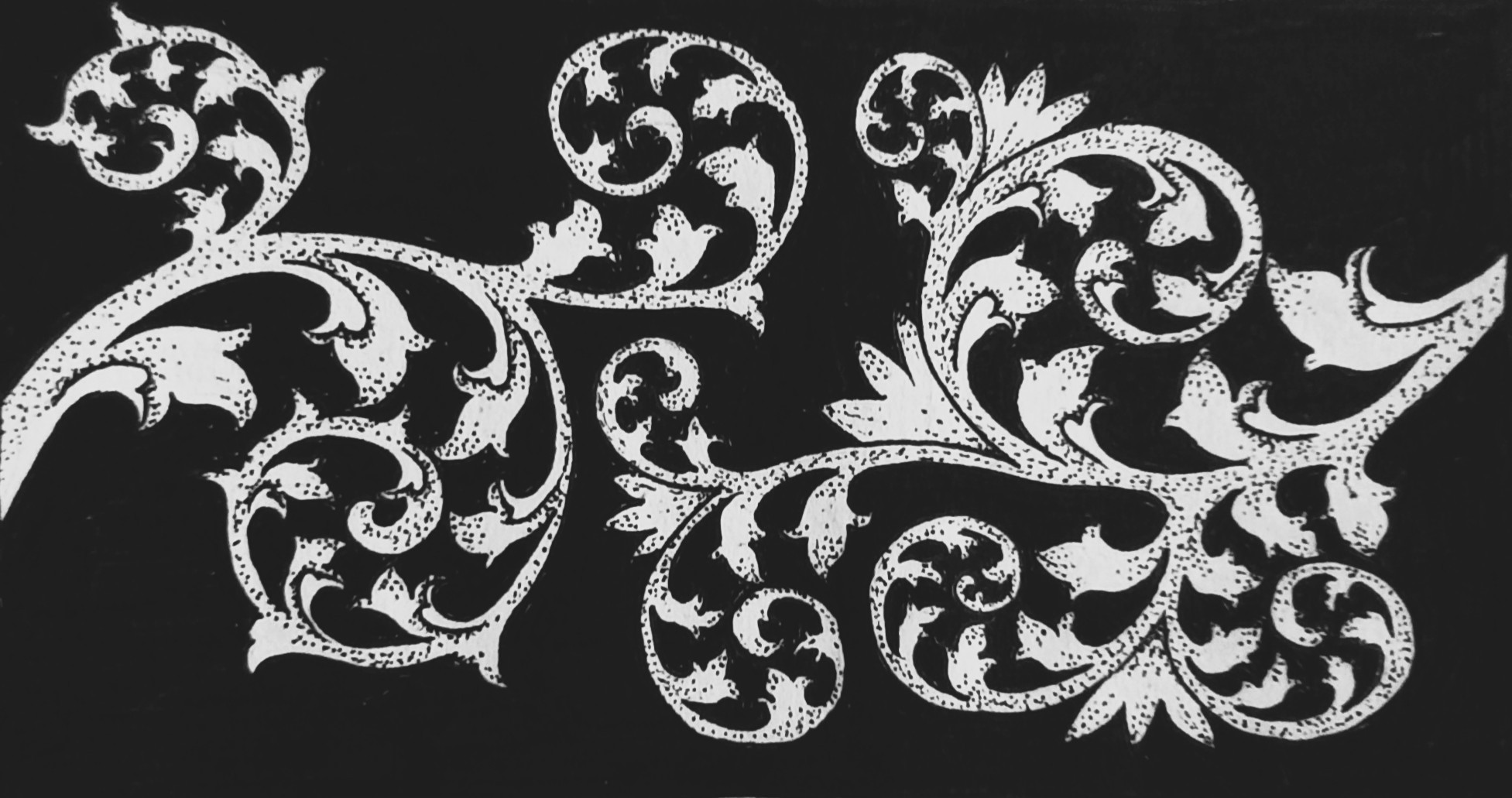
probably i should have gone with lines instead of stipples for shading and/or used finer point pen. but lives and learns right. it was pretty fun to try and i hope to get better at it so i can use scrolls for decorative borders & whatnot.
(edit to add: i know there’s a flourish missing some shading but this is shitty art share after all)
You’ve actually got the overall form, curve and balance of the shapes down really well here. I actually quite like the way you’ve done the shading, but yeah, worth trying some other options. Learning and improving is always a good thing :)
thankyou for the encouraging words! i hugely prefer doing stippling instead of lines for shading so i wanted to see if it could work for scrolls, i will probably try again with a larger piece to see if the effect can be clearer (as well as keep practicing hatch lines anyway, maybe one day i will get the hang of them!)
Perhaps test with a bit more white space in the stems - e.g. to just stipple along one or both sides, leaving the centre of each stem unstippled. Increase dot density towards the outside, then a bit lighter as it reaches the middle, then plain white right in the middle.
I think you could get the same shading effect from the stippling as from hatching - but it’s worth practicing both if you have the time to. If you don’t have time for both, and you enjoy the process of stippling, focus on making that work first - you’ll stick with it if you’re enjoying it more :)
good tips! i have done that same kind of gradation with simple borders and it works nicely so it makes sense to try it on these too, it will look a lot more coherent i think, and give the forms a bit of depth.
i think i need to be more patient when it comes to hatching, i can get it looking okay in isolation but once i try to put it on a form it looks chaotic and it is probably because i am rushing, whereas stippling feels a lot more meditative to me so it encourages me to slow down and relax! possibly why i enjoy it more too, haha.