carrylex@lemmy.world to memes@lemmy.world · edit-21 年前Has to be those frozen wind turbines and solar panels...lemmy.worldimagemessage-square85linkfedilinkarrow-up1411arrow-down122file-textcross-posted to: memes@lemmy.ml
arrow-up1389arrow-down1imageHas to be those frozen wind turbines and solar panels...lemmy.worldcarrylex@lemmy.world to memes@lemmy.world · edit-21 年前message-square85linkfedilinkfile-textcross-posted to: memes@lemmy.ml
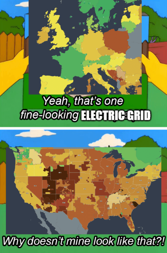
Template Source - The colors of the grids represent CO2 emissions The title is a reference to the 2021 Texas power crisis
minus-squarewhoreticulture@lemmy.worldlinkfedilinkarrow-up3·1 年前Are we looking at the same map? Looks like California is far less emissions heavy than the flyover states. High proportions of solar panel energy, too.


Are we looking at the same map? Looks like California is far less emissions heavy than the flyover states. High proportions of solar panel energy, too.
They are winning in producing emissions
that’s what I meant. bad wording.