
The Economist’s glass-ceiling index
Our annual measure of the role and influence of women in the workforce
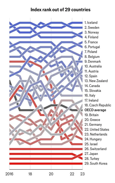
ARE WORKING conditions getting any better for women? The Economist’s “glass-ceiling index” offers some clues. Each year, to mark International Women’s Day on March 8th, we crunch the numbers on ten indicators—from labour-force participation and salaries to paid parental leave and political representation—for 29 members of the OECD, a club of mostly rich countries. Since we started in 2013 the pace of change has been glacial, but in most places things are at least moving in the right direction. Our chart below shows where women’s professional opportunities are greatest relative to those of men.
Iceland came first for the second year in a row. In fact, Nordic countries have always dominated the top of the index, scoring highly on all our measures. The bottom also has a familiar feel: women in South Korea, Japan and Turkey still face the biggest workplace obstacles. Australia and Poland were the biggest climbers, both up five spots from last year. Our ten charts below give a closer look at each indicator.
The first three broadly measure economic participation. In almost every country women graduate from university in greater numbers than men. Yet they make up a lower share of the workforce across our index. This is most notable in Turkey, Greece and Italy, where less than two-thirds of adult women are employed. The gap in labour-participation rates means that fewer women climb the corporate ladder, which feeds into the gender wage gap. In the OECD women earn around 12% less than men.
The next three indicators show the progress of women in business. Among people who took the GMAT, the de facto entrance exam for MBA programmes, the share of women fell slightly across the board. But women’s representation in senior management roles in the OECD reached 34.2%, up from 33.8% last year. Sweden, America and Poland are particularly impressive on this measure, with women holding more than 40% of high-level jobs. In Japan and South Korea the proportion is a disappointing 15% and 16%, respectively.The share of company board members who are women hit 33% across the OECD for the first time. In the EU women must make up 40% of board directors by 2026. So far only five of the 22 EU members in our index have reached that target (and all of those surpassed it).
Starting a family can make it hard for many women to stay in the workforce (an issue dubbed the motherhood penalty). Two factors can help them do both: generous parental leave and affordable child care. The length of paid maternity leave varies widely: Hungary, Greece, Slovakia and the Nordics are generous. America remains the only rich country where the government does not require employers to offer new mothers a minimum amount of leave. Leave for fathers is also important—it helps divide the burden of child care between parents. To encourage more women to enter the workforce, Japan and South Korea have enacted the most generous paternity-leave policies in the OECD (with 31 and 22 weeks, respectively, when adjusted for full pay) though few new fathers choose to stay at home.Another measure for parents is the cost of child care. The Fawcett Society, a gender-equality campaign group, recently estimated that 250,000 British mothers with children under the age of four had left the workforce. Its study cited the cost of child care and a lack of employer flexibility. Child-care costs take up around 25% of the average wage in Britain, compared with an average of 14% across the OECD.
Finally, to politics. Studies have shown that more women in political leadership leads to a greater focus on women’s rights and family policies. In Iceland, Sweden, Norway and Finland—the top four countries on our index—women hold at least 45% of parliamentary seats. In South Korea and Japan, on the other hand, their share is below 20%.Not all of our measures have equal weighting. Those concerning motherhood, for example, have less weight than those that affect all women, such as labour-participation rates. This year’s average score is slightly higher than last year’s, though on most indicators the rate of improvement has been slow. In most countries women are still struggling to break through the glass ceiling.
Latest data available.
*Population (aged 25-64) with tertiary education. †Female minus male rate. ‡Male minus female wages, divided by male wages.
**Lower or single house. §Shared parental leave is allocated to mothers; net earnings for Austria, France and Germany.
Sources: European Institute for Gender Equality; Eurostat; MSCI ESG Research; GMAC; ILO; Inter-Parliamentary Union; OECD; national sources; The Economist
https://www.economist.com/graphic-detail/glass-ceiling-index
Good gods! What happened to Hungary!?
Some wanna be dictator.
Another Putin Jr.
The order for the first few are just perfect….
Iceland and Sweden and Norway and Finland
Yakko ftw
deleted by creator
And related, while indeed more women work part-time than elsewhere in the Netherlands, I believe it’s also true that more women work in general. So the average number of hours worked per woman might still be higher over all women.
I mean from the text that was posted alongside the image, it does seem to measure general participation in the workforce, like for example it says it takes into account when women leave the workforce to focus on child rearing.
I always think that’s the wrong comparison to make. Women and men have different hormone levels and brain organization, which leads to different behavior. With all the data we have, it simply seems like women care less about a work career. So that means if there’s a difference in work force participation, that’s not a bad thing.
Poorly titled graph: “Index rank out of 29 countries” - What index? Which 29 countries? Untitled Y-axis. Did they do this to deter from posting the ambiguous graph without the article link?
EDITED to add: The title in the image should have been “Where women’s professional opportunities are greatest relative to those of men - The Economist’s glass-ceiling index rank out of 29 of 38 OECD countries (ordinal scale)”. That way the image would make sense by itself when reposted in various places.
An example of a faultless graph:

Now look at this again - it doesn’t say what it means:

The y axis is the rank… The 29 countries are listed 1-29
Indeed, but you can’t find it out from the picture without reading the article, which may have been the intention.
I thought it was obvious from the graph itself? Maybe I’ve seen too many graphs…
Nah I also got it right away (to be fair maybe I also looked at too many graphs). What wasn’t was just how they make the ranking, but I doubt you could fit that on the chart itself.
It’s self-evident imo that it’s the ranking. The title is “ranking of 29 countries” and then you have individual spots from 1 to …29.
The title in the image should have been “Where women’s professional opportunities are greatest relative to those of men - The Economist’s glass-ceiling index rank out of 29 of 38 OECD countries (ordinal scale)”.
“rank” is not ambiguous. The title explains what the y axis is.
No, “index” is ambiguous. The title in the image should have been “Where women’s professional opportunities are greatest relative to those of men - The Economist’s glass-ceiling index rank out of 29 of 38 OECD countries (ordinal scale)”.
I’m genuinely drawing a blank. What else could index mean here?
Most of you seem to be thinking I’m talking about the post. When I said graph (my bad), I meant the picture of the graph that will be reposted elsewhere out of context. The text near the image doesn’t go with it, the whole context must be contained in the image. You can’t trust reposters to copy-paste some text with the picture they saved one day and later repost on many other channels.
An example of a faultless graph:

Problem with rank: 1.000001, 1.00000011, 1.000000012 and 100000000 are all separated by 1 from their neighbors.
I don’t know how worse South Korea is from Turkey. What does being “1 better” mean?
Or how good Iceland is compared to South Korea…
SK is a neoliberal shithole, fascist leader and all. If you want to see what unfettered capitalism looks like, just take one look at South Korea.
What caused Hungary to nosedive in 2021?
Viktor Orban gained enough power to make himself autocratic leader and end democracy.
Well yeah, but that’s been going on for over a decade. Something specifically related to women seems to have happened in '21.
End? No. There are leftovers.
It’s ranked as flawed democracy in the demicracy index… Same category as the USA by the way, but worse than the USA.
But yeah… He damaged it heavily.
https://en.m.wikipedia.org/wiki/The_Economist_Democracy_Index
deleted by creator
Israel is an interesting case… The stats are skewed because Israel has the biggest amount of religious “minorities” in any developed country. But if you look at the Tel Aviv bubble then it’s almost 50/50.
I spent a semester in Budapest 😎
Fuck yeah Nordics ftw ☆:.。. o(≧▽≦)o .。.:☆
data gore.
Why did the average nosedive in 2017? Did something happen across the board or did measures update?
I’d like to think Hungary just took it down by itself (I know its an outlier and not possible though).
I thought so too, but the drop happened before Hungary.
It’s possible that the methodology changed, as it has changed at some point between 2017 and the index’s launch in 2013, but a quick search isn’t turning up an answer for when it happened as most of the actual articles are paywalled. On the other hand, it’s possible that the actual score on the index didn’t change much. This graph just shows the ranking, not the absolute score, so it’s possible that the OECD average in both 2016 and 2017 was 50% but the six countries that overtake the average in that year each went from, like, 49% to 51%
Thank you, this makes sense. Statistics has never been my strong suit.
Archive link. Graphics are kinda messed up though since it looks like it uses interactive content that the archiving process didn’t handle well.
Switzerland absolutely deserved it’s position. This country truly hates women
Thanks to the CVP
Title: “top places in the world […]”
Content: just about OECD countries
Implication: OECD = the world


