
- cross-posted to:
- technologie
- pangora@programming.dev
- cross-posted to:
- technologie
- pangora@programming.dev
Hello everyone! I’ve pushed out a public alpha build to https://beta.pangora.social for people to start giving feedback on the design before it becomes more fleshed out
Feel free to check it out and say what you like or dont like in the comments here.
The UI there is currently pointing to the programming.dev instance
⚠ Warning: This is an alpha, things are still very unfinished. You cant use this as an alternative to lemmy-ui yet since things such as logging in aren’t supported
⚠ Warning 2: If you attempt to use this on mobile currently it will be very broken
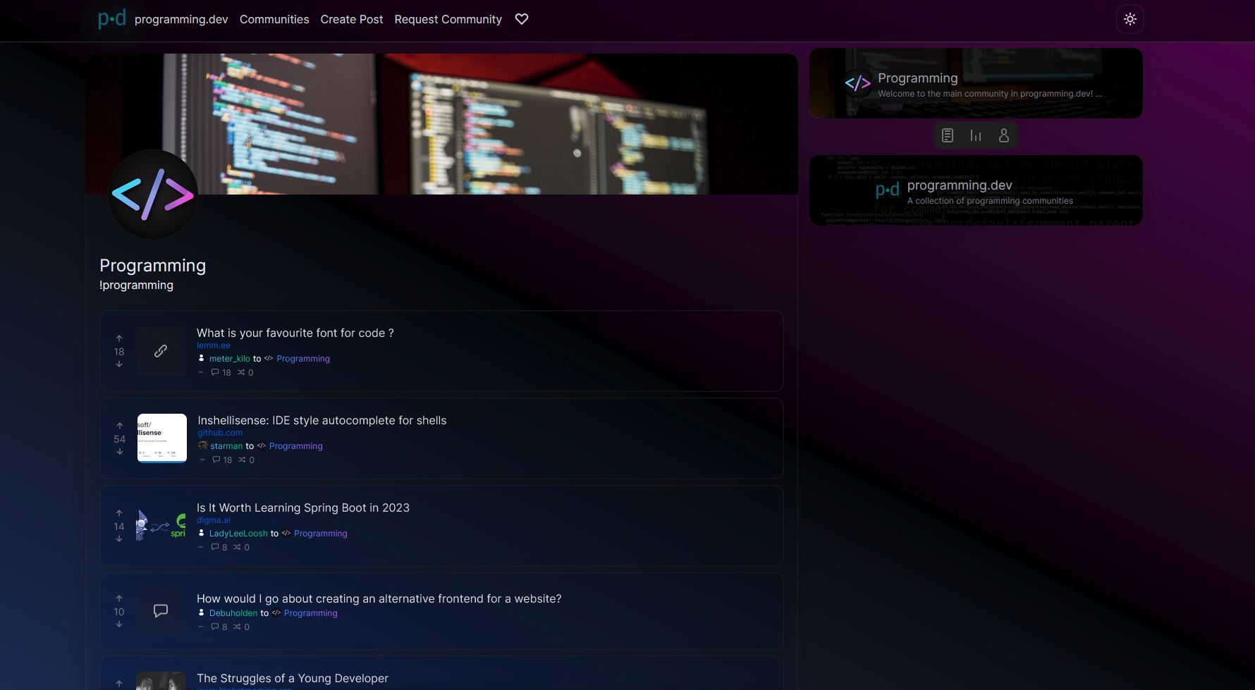
I constructed the UI by seeing what people liked from lemmy-ui, alexandrite, and photon and trying to match it up to how lemmy-ui is built so that it would be an easy switch between them
Main site mechanics that is different from lemmy-ui
- Comments from cross-posts show up when looking at a post (will be changed in the future to only communities that community has whitelisted to do it for once I mess around in the backend more)
- Comments and posts that have 0 or less score in terms of upvotes/downvotes will be collapsed by default
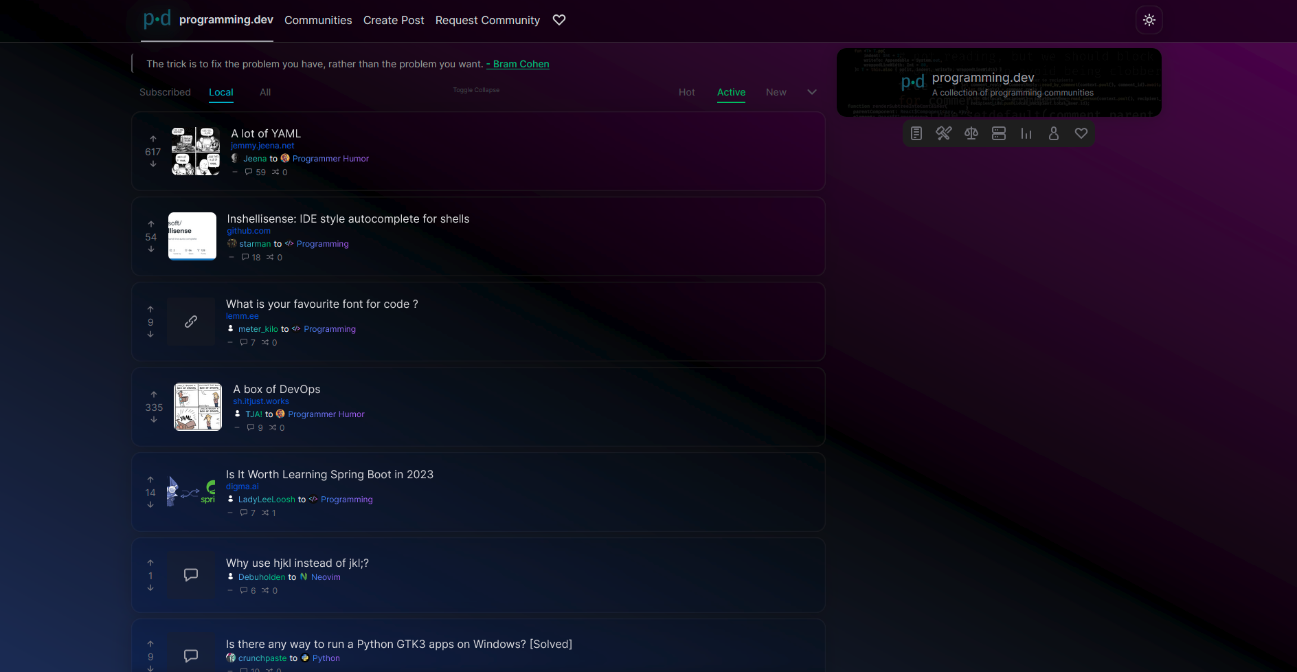
- Clicking on a post in the post feed makes it show up overlayed on top of the feed similar to alexandrite’s system instead of sending you to a new page. (hitting the name of the post when in this preview state will send you to the actual page)
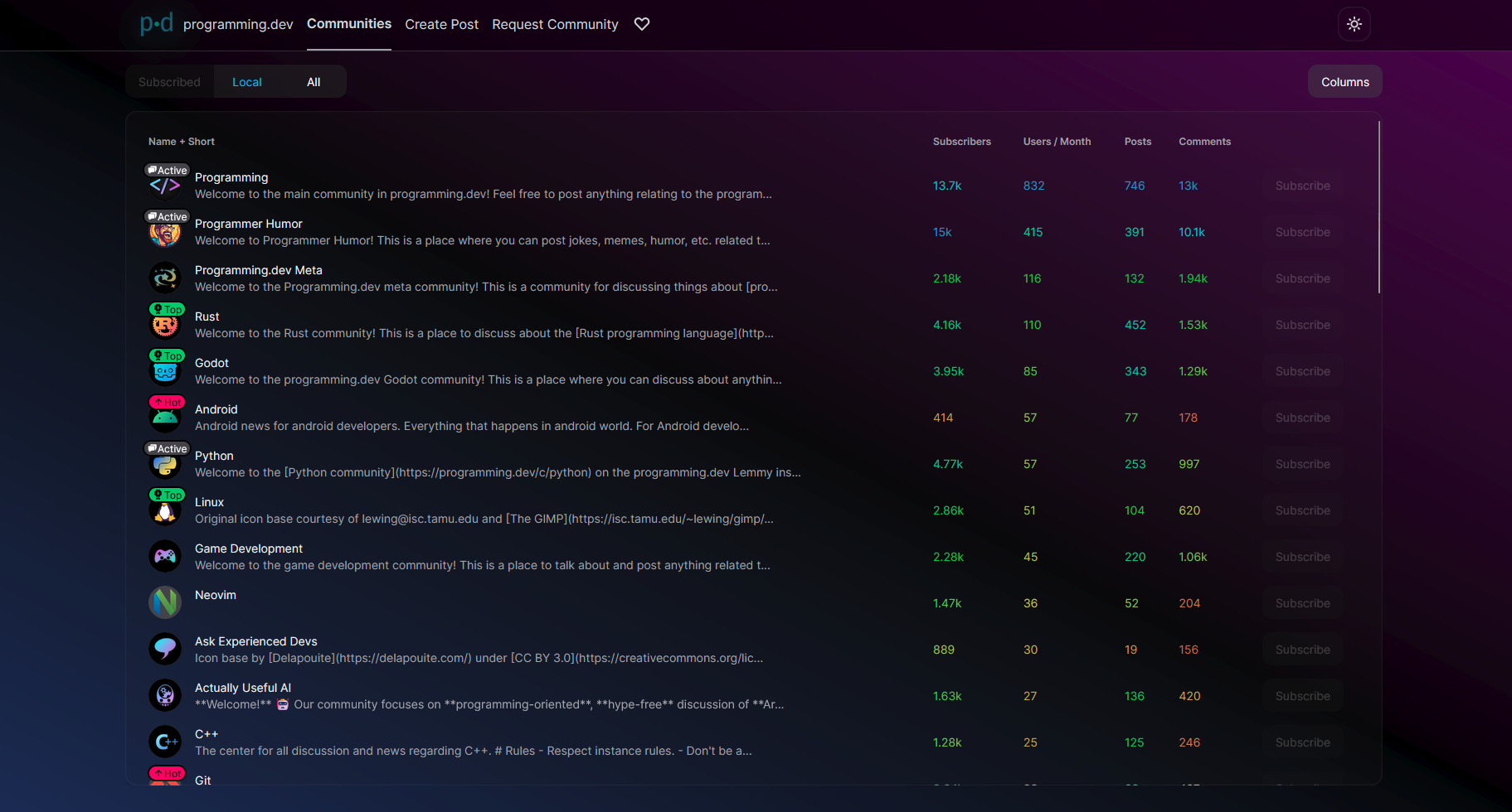
Images:

You must log in or # to comment.
It looks very slick and clean, and I like that, but please tone down on the gradients and transparency, or at the very least provide a high contrast option without them.
Clicking on a post in the post feed makes it show up overlayed on top of the feed similar to alexandrite’s system instead of sending you to a new page. (hitting the name of the post when in this preview state will send you to the actual page)
This is by far my favorite Alexandrite feature, and the main reason I use it over the alternatives. Thanks for including it!
Loving what I see, can’t wait to try it!
Slick! My feedback:
- Consider respecting the user agents color scheme preference (I like to have light mode on day and dark mode on night — don’t overwrite that without my permission if you already have both themes).
- Contrast is too low in the dark theme and way too low (basicly unusable) in the light theme.
- Consider increasing font size, esp. for code blocks
- For me it’s wierd that posts are kinda centered but not really. Since most (not all) languages are left to right, I’m used to start looking on the left side, not the right. Consider centering the post properly.
- Consider making the hover animations faster.
- In dark mode, the icon button hover text is black on dark gray and therefore basicly unreadable.
What is this dot between the three-dot menu button and the time stamp?

Personally, I don’t really like that the post is displayed transparently over the post list. This makes it a lot harder for me to focus on the content. Maybe I’m not the target group for a design like this.
Thanks for the feedback
Yeah light theme is something I’ve barely touched currently but will get the colors on that fixed in the future and will be adjusting the colors in dark theme
I’ll note down to fix the theme user agent and font size
For the post you’re saying to center are you talking about the post view that pops up from clicking a post in the post feed?
The dot there isn’t anything, I was just using it to separate the buttons from the time
And yeah I can tweak the transparency there a bit so the feed doesn’t have any attention


