
- cross-posted to:
- technologie
- fediverse@lemmy.world
- cross-posted to:
- technologie
- fediverse@lemmy.world
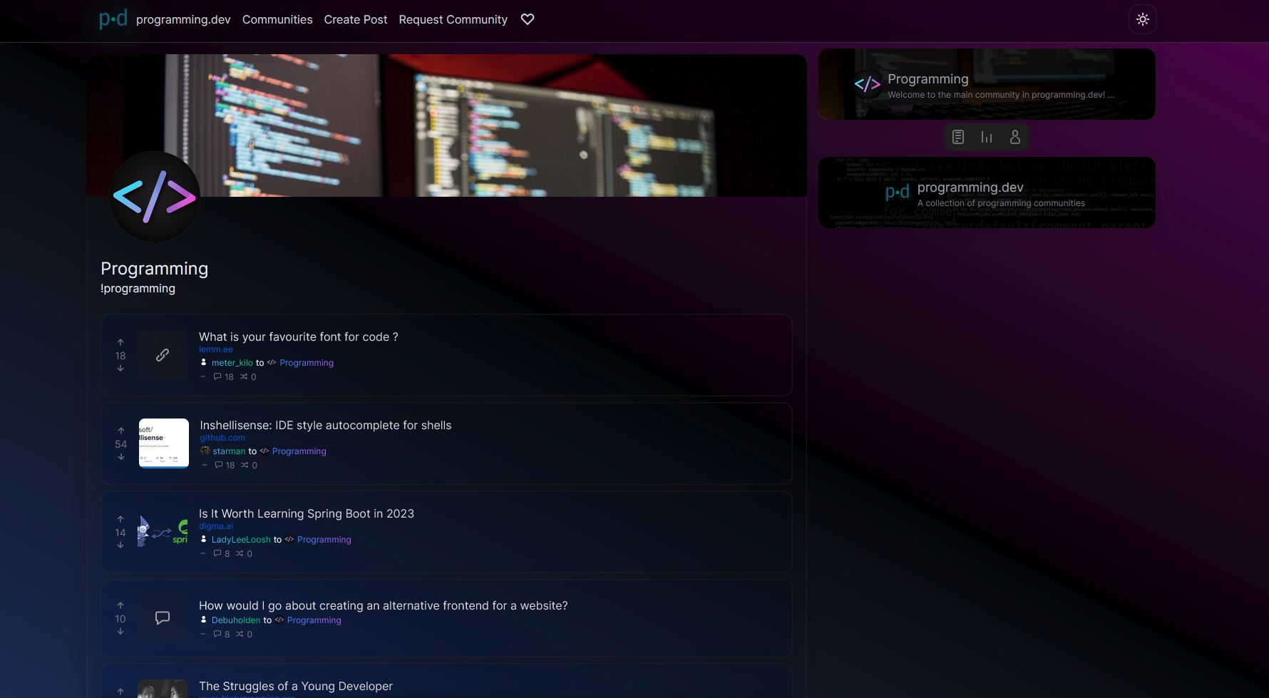
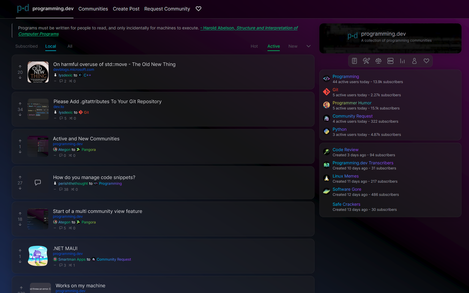
Hello everyone! I’ve pushed out a public alpha build to https://beta.pangora.social/ for people to start giving feedback on the design before it becomes more fleshed out
Feel free to check it out and say what you like or dont like in the comments here.
⚠ Warning: This is an alpha, things are still very unfinished. You cant use this as an alternative to lemmy-ui yet since things such as logging in aren’t supported
⚠ Warning 2: If you attempt to use this on mobile currently it will be very broken
I constructed the UI by seeing what people liked from lemmy-ui, alexandrite, and photon and trying to match it up to how lemmy-ui is built so that it would be an easy switch between them
Main site mechanics that is different from lemmy-ui
- Comments from cross-posts show up when looking at a post (will be changed in the future to only communities that community has whitelisted to do it for once I mess around in the backend more)
- Comments and posts that have 0 or less score in terms of upvotes/downvotes will be collapsed by default
- Clicking on a post in the post feed makes it show up overlayed on top of the feed similar to alexandrite’s system instead of sending you to a new page. (hitting the name of the post when in this preview state will send you to the actual page)
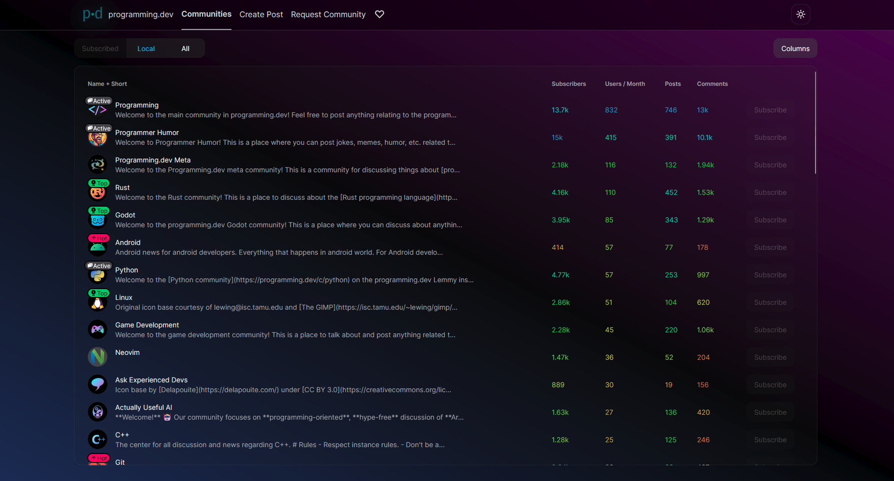
Images:

You must log in or # to comment.
Cheers for adding to the alternate frontend scene in Lemmy. It’s nice seeing more options.
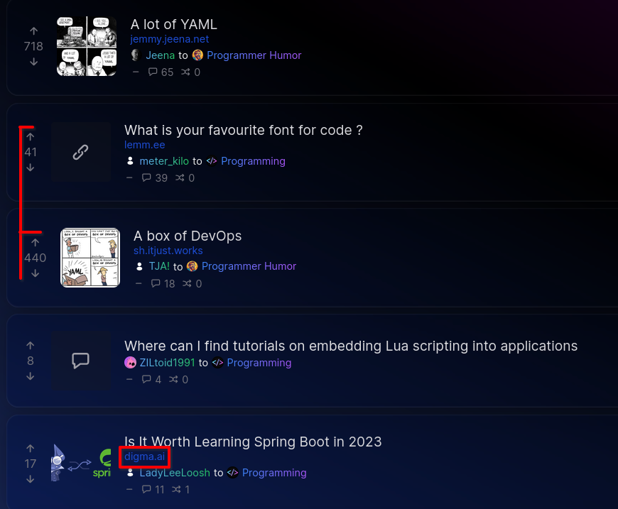
Some things that jumped out to me:
-
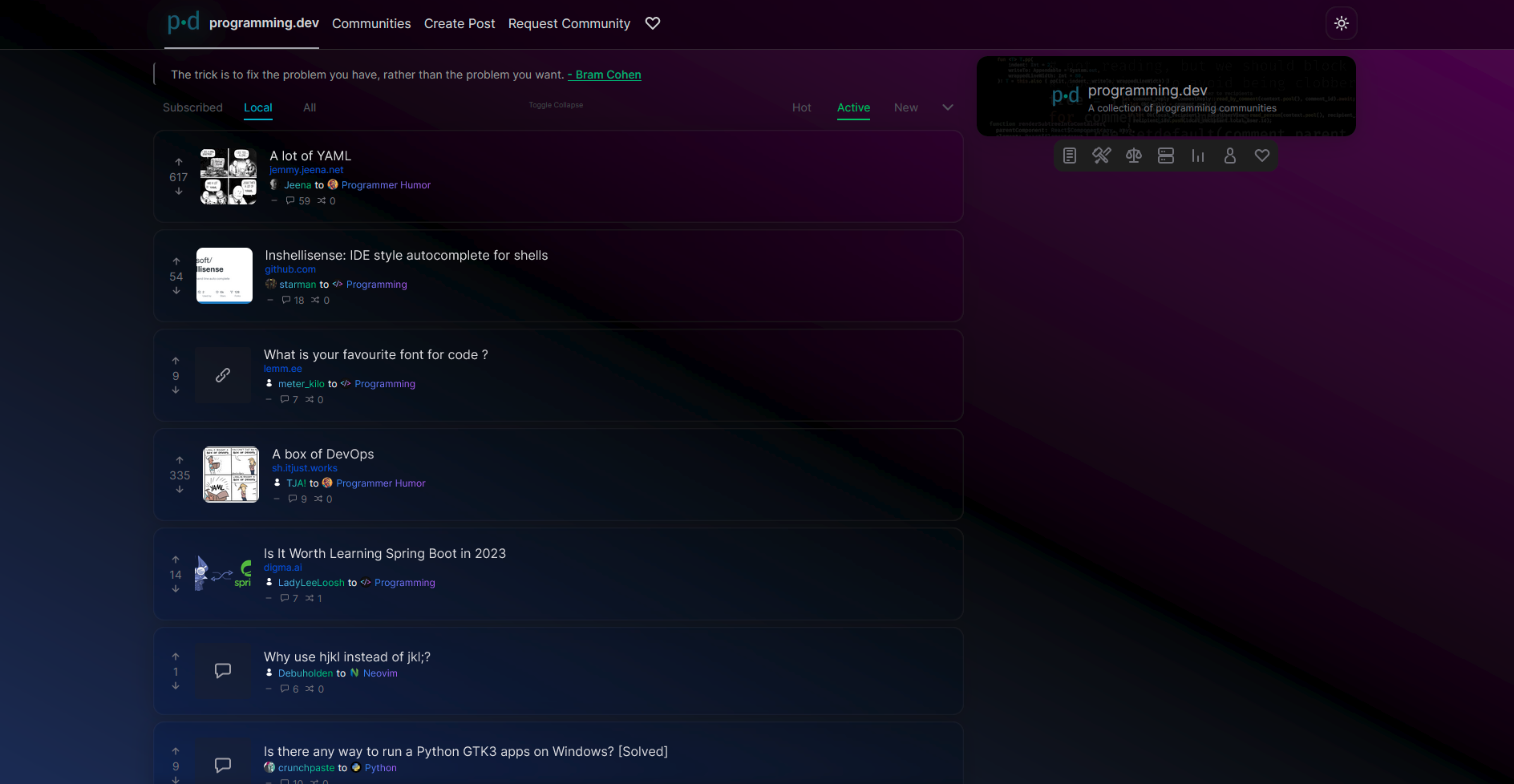
Dark mode feels a little too dark. I can barely see post separators and as a result the page blends together making it a bit hard to read.
-
The upvote/downvote arrows are at different positions depending on the vote number (see 1st pic)
-
The deep blue color for links mixes with the blue in the background, making it hard to read (see 1st pic)
-
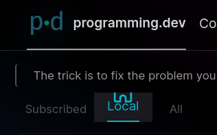
The icons in the top toolbar clip into the div above it (see 2nd pic)
-
I’m a fan of the gradient-first design, but not everything has to be a gradient imo. Usernames and community names are hard to read.
-
I think it should show the community/instance sidebar by default considering the right side of the screen is initially empty
-
Not a complaint this time, I really love the comments section UI. It’s very clean and readable. I also love that it’s a sidebar similar to Alexandrite.
With a few color & theming tweaks it’s already very usable and well made. Everything seems to be working properly coding-wise. Good luck on your project!
thanks for the feedback!
yeah ill have to look at the colors a bit more. I was trying to draw attention towards the post titles since its the most important thing on the page but made other things too much darker
Will look into fixing the upvotes and the bar icons.
I hid the details from the right since I felt it was information overload for people looking at the site but yeah its a bit empty there so can look into changing that and maybe just doing things like tweaking colors
-
Looks really good and the comment cross posting is great! Why will it be switching to an allowlist? Seems like it’ll just cause it to very rarely be used when it should be something all apps/uis adopt
Does this ui work without javascript?
The reason for the switch is mostly from a moderation perspective. If its unrestricted showing comments from other communities then people can whip up other communities on some instance and get them to show comments that normally would go against the rules of the community but cant be moderated since the comments arent actually in the community
Whitelist by default allows people to enable it for communities that they know have active mods and similar rules and ties it in a bit better with another feature which is post sharing which will also be an allowlist as well.
I could add some sort of button called “show comments from unwhitelisted communities” but it wont be the default
Requires javascript like every other lemmy frontend since it needs to be reactive and due to how lemmy is setupUpdate: found out mlmym doesnt need javascript. Could see how they deal with things and try to apply it here
Ah that makes sense and yeah that button would be nice
Also FYI, the post about the January update did not federate to my instance: https://discuss.tchncs.de/c/pangora@programming.dev
I guess it was lost in the 19.1 turmoil
Hi there! Looks like you linked to a Lemmy community using a URL instead of its name, which doesn’t work well for people on different instances. Try fixing it like this: !pangora@programming.dev
Any other news on the project in general too?
The UI has been getting most of the dev time so that it can be fully built up and swapped to by programming.dev before we start extending out the backend. I merged code block support to lemmy-ui as well so that should be arriving in all instances in 0.19.
Backend has mostly just been me analyzing it and making sense of the different parts so I can add things in the future
Pangora.social just got an update to make it automatic by pulling data from fediseer
Havent been able to get too much dev time recently though since its midterm season but there should be some more progress for the next bit assuming I dont get a lot of work dumped on me. Currently mostly still just me doing development and this is third in my priorities after uni and gamedev. Probably will make posts in the future around lemmy looking for more developers
I think the gradient background is a bit too bright? I reduced the luminance for the colors down to 7% and I think it’s easier to read, but I’m not a graphic designer at all lmao
:is(.dark .dark\:to-fuchsia-950) {
    --tw-gradient-to: #200222 var(--tw-gradient-to-position);
}
:is(.dark .dark\:via-black) {
    --tw-gradient-to: transparent var(--tw-gradient-to-position);
    --tw-gradient-stops: var(--tw-gradient-from),#000 var(--tw-gradient-via-position),var(--tw-gradient-to);
}
:is(.dark .dark\:from-blue-950) {
    --tw-gradient-from: #080c1c var(--tw-gradient-from-position);
    --tw-gradient-to: rgba(23,37,84,0) var(--tw-gradient-to-position);
    --tw-gradient-stops: var(--tw-gradient-from),var(--tw-gradient-to);
}
also on light theme the posts have a different background color, outline, and shadow so they stand out well from the background, but on dark theme the post background is transparent so they don’t stand out from the background at all, that might be a better fix than the CSS changes above
but again I’m not a graphic designer and I’m actually a fan of very plain readable themes
Yeah I reduced the amount of transparency on the post cards after this round of testing. Now only half transparent
Thank you for your work!


