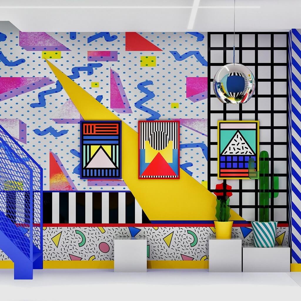
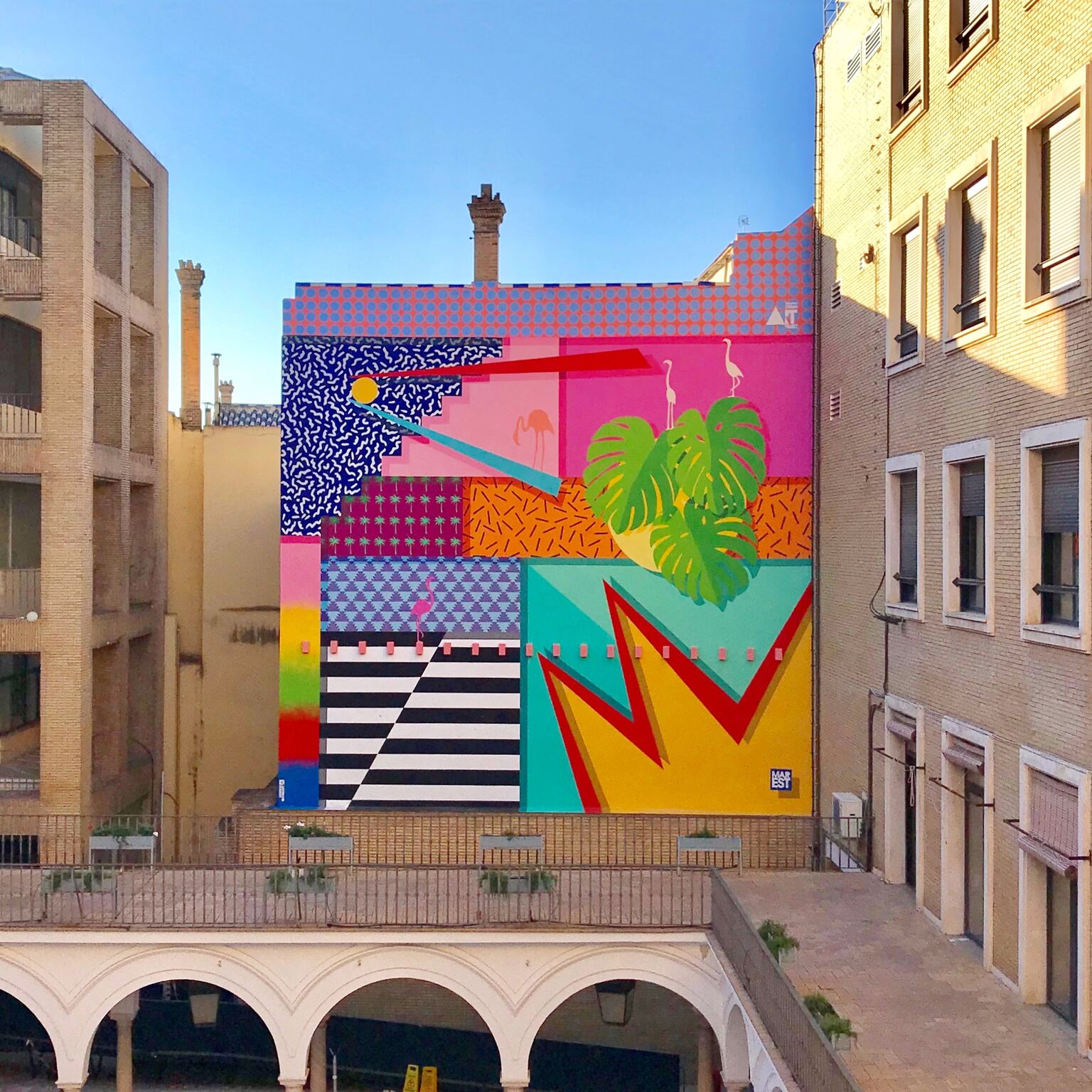
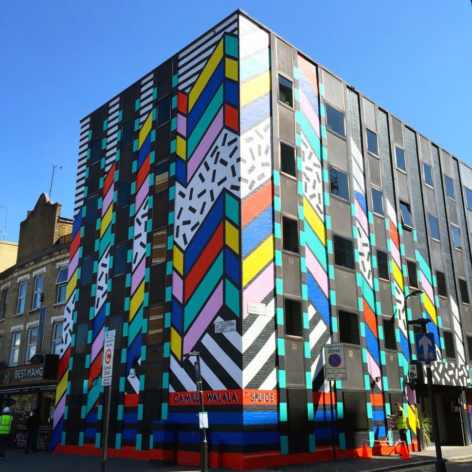

I kind of like how blatantly ugly it is. But maybe that’s nostalgia talking
Memphis rap albums have the best art
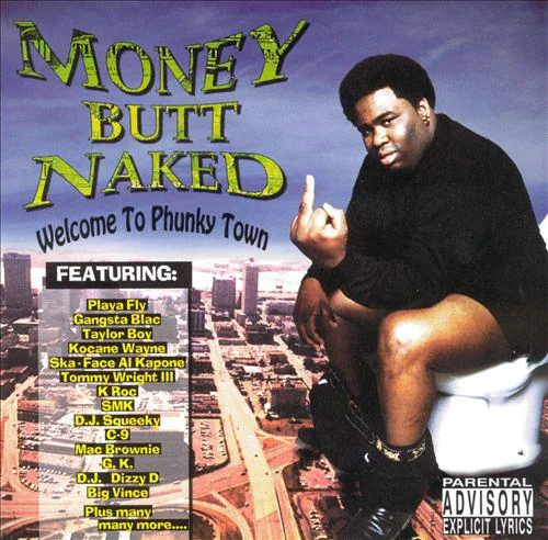



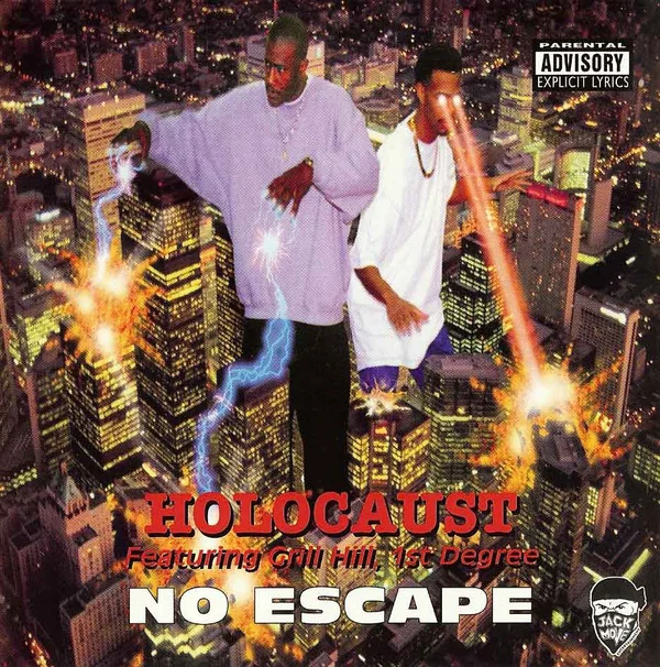
Hell yeah
Don’t forget pen and pixel outta Houston.

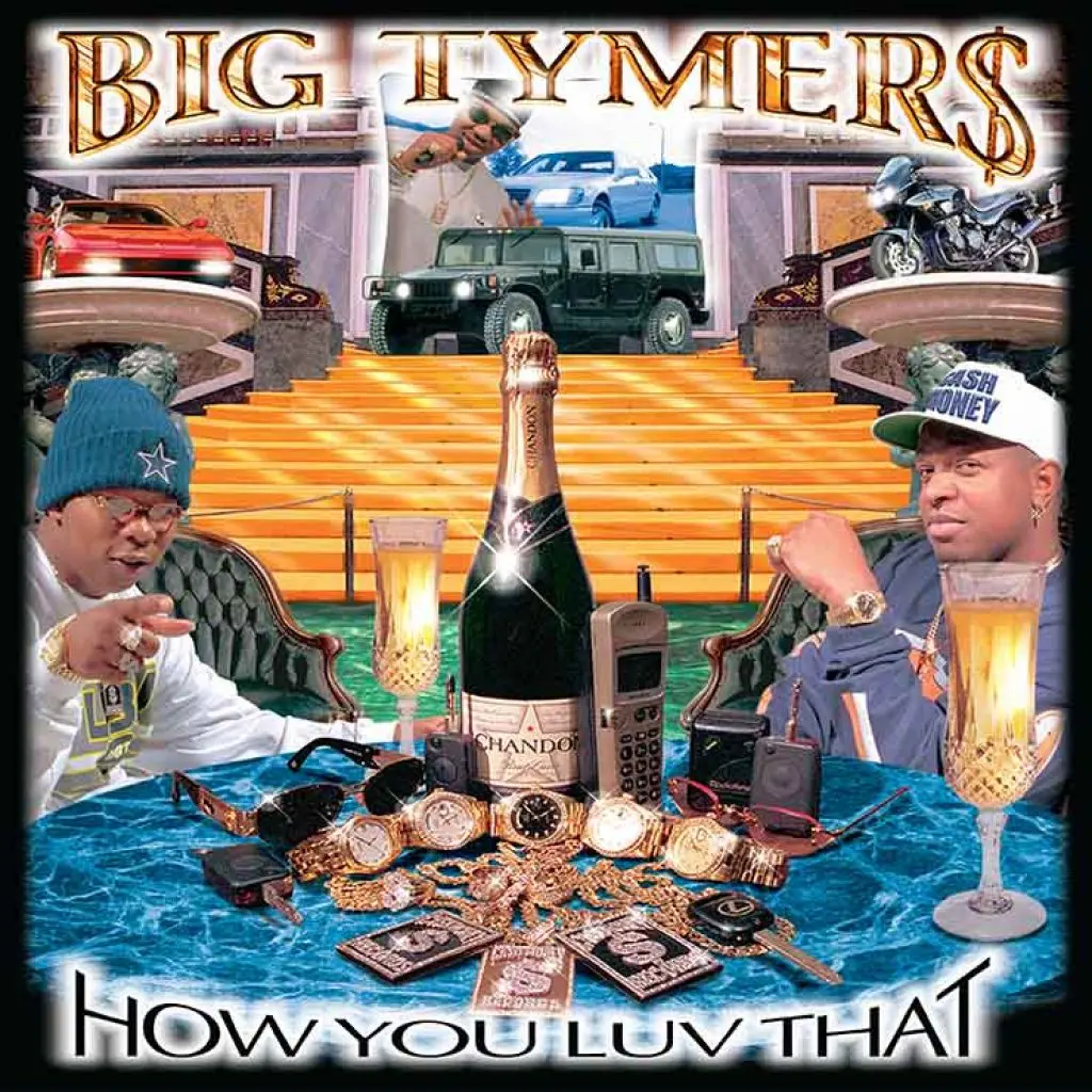

These all rule
I am overwhelmed. They are so good.
god. the murals are one thing but being in a room like the main of the post would make me want to scream and vomit at the same time. I’m getting anxious and overwhelmed just looking at it. imagine that being the waiting room for the dentist. fuck.
It got all the sensory bombardment of a klasky csupo cartoon

Capitalism really is the imperialism of labour. It invades, consumes and bastardises the things humanity creates.
Is capitalism the imperialism of labor, or is imperialism the highest stage of capitalism?

This is what every rebel base will look like in 2040 in order to confuse the autonomous attack drones’ computer vision subsystems.
Similarly, postmodernism did have much to say especially as an overall form of literary and artistic analysis and critique, but after a century of being the status quo, I’m bored and tired of “if this art exhibit confuses or pisses off those silly ignorant masses, I win”
 gimmicks, especially when the rich use them to launder money.
It’s very Art Attack, so nostalgia is definitely playing a huge part when I look at it. I think the disconcerting part of Corporate Memphis is when the geometricity is applied to human figures to become this weird flattening. To me it’s infantilising without the humanising elements of flaws or discernable features. It’s like if someone was told what ‘Hello Kitty Kawaii’ without any reference images and then told to recreate stock photos with that imagined style.
I think the disconcerting part of Corporate Memphis is when the geometricity is applied to human figures to become this weird flattening. To me it’s infantilising without the humanising elements of flaws or discernable features.
This is true because Corporate Memphis is Memphis with all the details removed. Corporate Memphis is that way because corporate art has to be simplified in order to produce the vast amounts needed to maximise profit for design companies. I know people who work in graphic design, and they are AMAZING artists, but the work they produce for their day job has to be simplified Corporate Memphis in order to meet quotas, sometimes they are expected to illustrate an entire marketing campaign in half an hour.
However when you remove the “Corporate” from Memphis the style is capable of portraying unique characters. Nigel Thornberry is iconic, you can tell exactly what kind of character he is by looking at him.
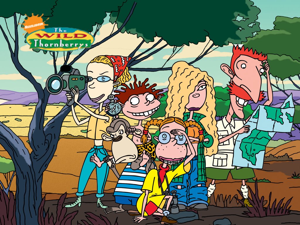
Ty for the mini lesson! People who can draw/illustrate/design well will never not be impressive to me (wow what an awkward sentence). It would be disheartening as an artist to have to put those skills towards churning out marketing shlop day in day out.
The graphic design industry really is fucking evil. I could tell you so many horror stories from people I know who work in the industry, but doing so would dox the hell out of them.
Also thank you for putting up with my lecturing lmao

Memphis is just a giant 90s Taco Bell?
Yes and arcade carpet


