- cross-posted to:
- gaming@lemmy.ml
- gaming@beehaw.org
- cross-posted to:
- gaming@lemmy.ml
- gaming@beehaw.org
My personal one, 6-year-old brain thought I’d be basically in the UK TV show Knightmare I got some vertical frogger
It took me years to start the Monkey Island Series because the cover for Monkey Island 2 was too scary for me.

There’s nothing disappointing about monkey island
Escape is.
Never spend more than twenty bucks on a computer game.
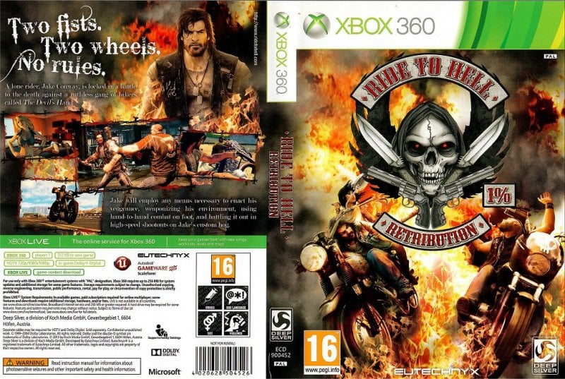
Title is fucking metal. Box is wild. Panned as one of the worst games ever made
Have you ever watched gameplay? It is so fucking bad, but kinda funny to watch someone play
Yeah it’s horrible, but I think it’s made even worse because the premise and concept sounds like it’d make for a really great game. An open world sandbox of ass kicking, like Hell’s Angels meets Fallout with a destructable/interactable environment. It’s such a good idea but unfortunately Rockstar didn’t pick up on it and we got this instead :-/
Kinda funny seeing that “Bleeding Cowboys” font on the back, on a commercial product out in the wild. Maybe it just looks similar haha.
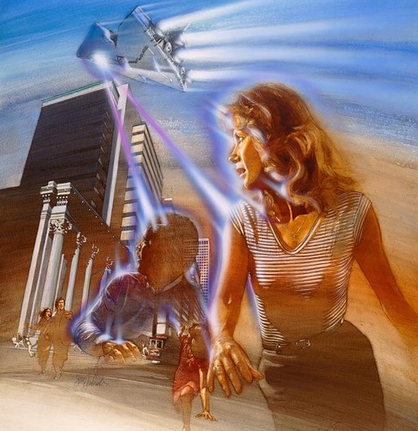
Defender was nice, but the cover made me expect too much
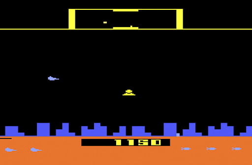
Dude defender was great
That woman takes up a ton of cover tho
For good reason
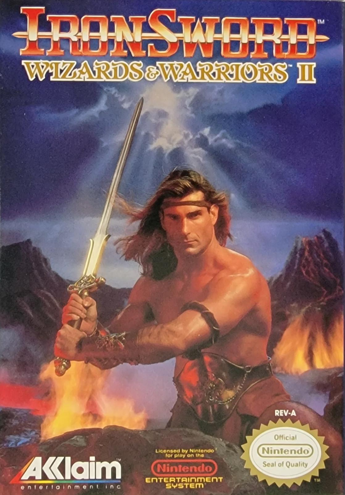
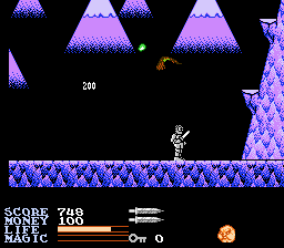
Is this the game where the main character gets hit by a bird while on a roller coaster?
I haven’t played this since it was new, so my memory is a little foggy…
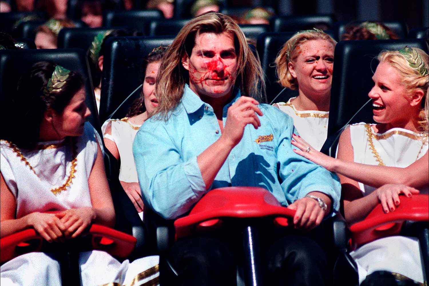
Even with a broken nose he’s still immaculate. Life goals.
Damn I forgot all about this, that was a serious birdstrike
They were joking about that happening to Fabio, the model on the cover.
Unofficial model. They did the same thing with contra when they had Arnold and Sly on the cover.
Oh really? That’s interesting.
Can’t speak for the second game, but Wizards & Warriors 3 was fucking awesome.
just about any game from the 80’s 8bit era was sold by the tape insert’s artwork… but that artwork was so fine I do miss it today.
Having the equivalent of movie posters as games’ cover art was awesome, if terrible for showing what the game was.
It always amazes me that the European version of Mega Man has a fucking fantastic cover

Why in the fuck does bad box art Mega Man exist if this cover is a thing?
I’m seeing a lot of games with awesome cover art but pretty standard gameplay for its era. You gotta pick something with truly dogshit gameplay to counter the cover. I present the NES game Dr. Jekyll and Mr. Hyde:
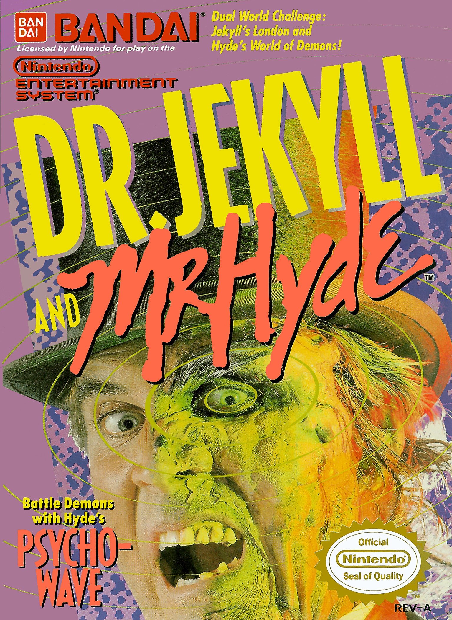
I was the kid who liked to stand in the horror section of the video rental store, look at the covers, and read the descriptions of scary movies I was way too meek to ever actually watch. This comes along, and I think it looks pretty cool! My mom paid good money to rent this and so help me I spent a good chunk of my evening trying to figure out how to do… literally anything. I wandered back and forth as Dr. Jekyll for a while before I bumped into too many pedestrians and turned into Mr. Hyde. Then I wandered back and forth as Mr. Hyde until I believe a bird killed me. Never made it past the first level.
That is a truly horrendous game with badass-looking cover art.
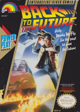
Loved these movies as a kid. Still one of the worst games I’ve ever played.
The ljn logo is like a biohazard sign for games from that era.
Have you played the second one? I begged my parents for weeks to rent it. Then I got it and… I can’t even describe it. At one point there’s a platformer puzzle room based on the Three Bears. I played it for a whole weekend because I couldn’t believe how awful it was.
Forever ago, out of morbid curiosity. I do vaguely remember it being quite bizarre.
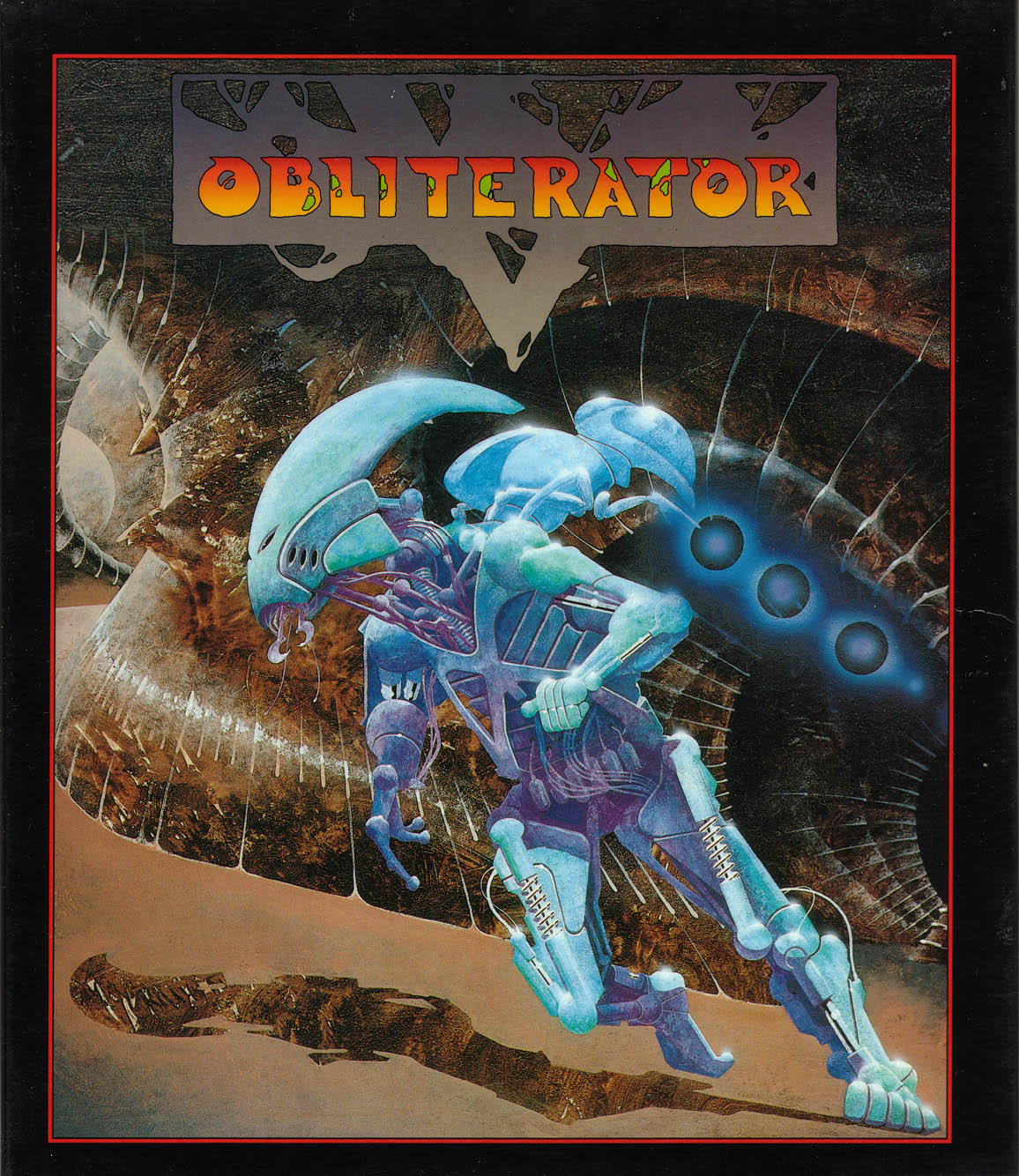
Cover for Obliterator on Atari ST looked so cool. Game was a weird, slow, springy platform with odd controls.
Hah, pretty sure I still have that game on 3.5” disk for DOS.
Ahh CGA…
Phalanx comes to mind
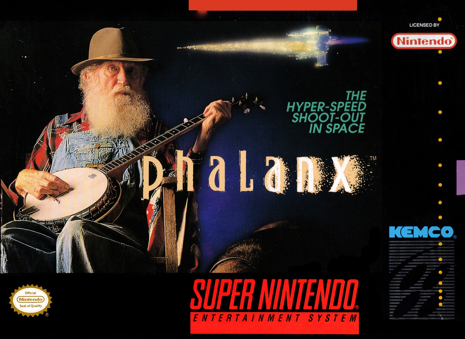
I feel like that’s the opposite. The cover is weird AF and has nothing to do with the fact it’s a pretty good sci-fi SHMUP lol
Unless you got hyped up for hillbilly banjo slappin’ action and were disappointed it was a shoot 'em up… 🤔
Some banjo action was expected!
Jk it was a fine game and had an awesome cover in a weird way.
Oddly enough, I ended up buying Shadow Dancer specifically because the cover was so bizarre.
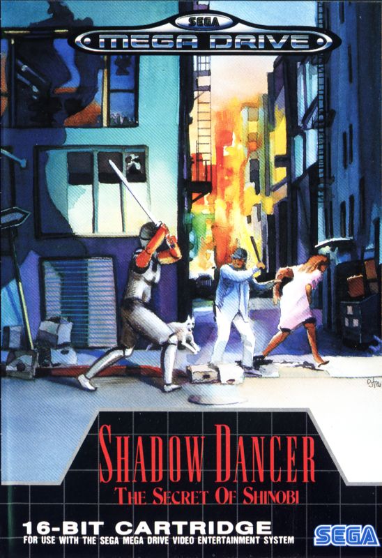
An old man with a bat protects a young woman from a plate armored man attacking both of them with a longsword, as a scared dog flees into a burning city in the distance.
Love it!
Yeah, I wanted some old-man-with-a-banjo action and ended up with a space shooter.
This is the one that got me when I was younger:
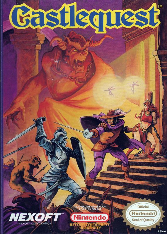
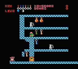
Turns out its a platform puzzle game with no attack button. Enemies can only be defeated by pushing blocks onto them.
Kinda wish we’d see more modern games come out with this classic movie style cover art


