

- cross-posted to:
- technologie
- fediverse@lemmy.world
- cross-posted to:
- technologie
- fediverse@lemmy.world
Hello everyone! I’ve pushed out a public alpha build to https://beta.pangora.social for people to start giving feedback on the design before it becomes more fleshed out
Feel free to check it out and say what you like or dont like in the comments here.
⚠ Warning: This is an alpha, things are still very unfinished. You cant use this as an alternative to lemmy-ui yet since things such as logging in aren’t supported
⚠ Warning 2: If you attempt to use this on mobile currently it will be very broken
I constructed the UI by seeing what people liked from lemmy-ui, alexandrite, and photon and trying to match it up to how lemmy-ui is built so that it would be an easy switch between them
Main site mechanics that is different from lemmy-ui
- Comments from cross-posts show up when looking at a post (will be changed in the future to only communities that community has whitelisted to do it for once I mess around in the backend more)
- Comments and posts that have 0 or less score in terms of upvotes/downvotes will be collapsed by default
- Clicking on a post in the post feed makes it show up overlayed on top of the feed similar to alexandrite’s system instead of sending you to a new page. (hitting the name of the post when in this preview state will send you to the actual page)
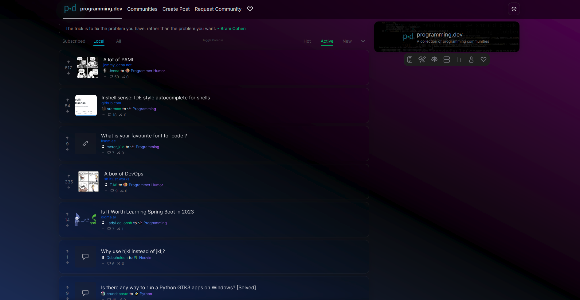
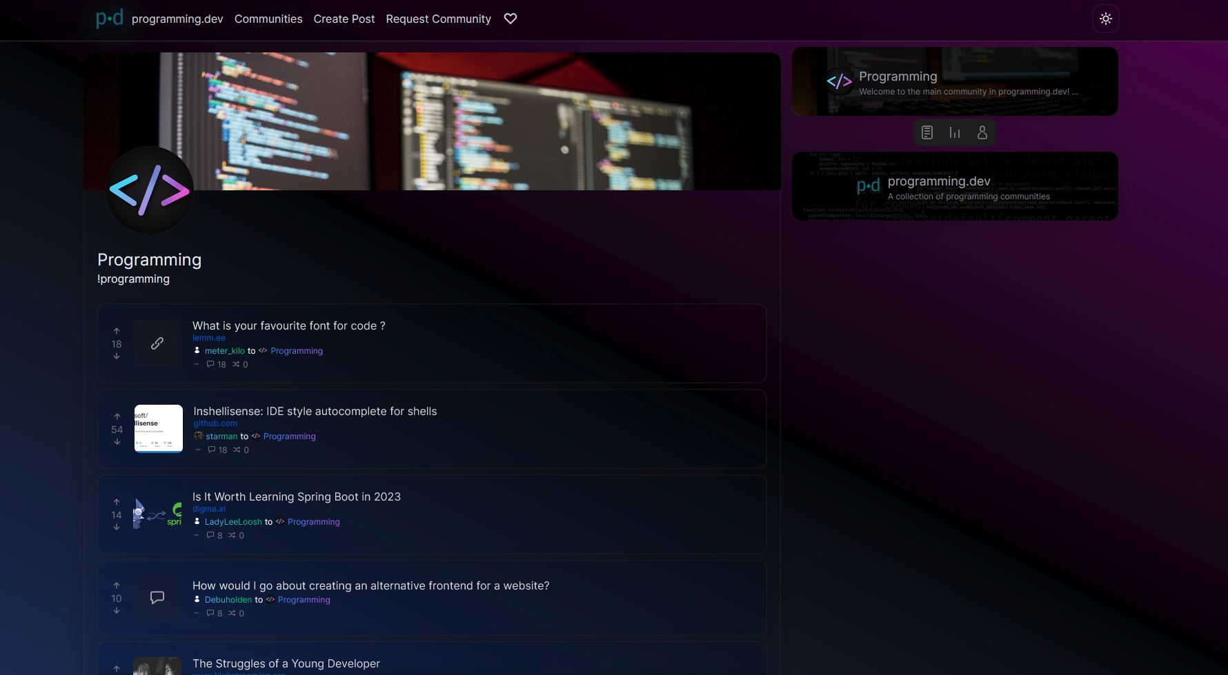
Images:

Cheers for adding to the alternate frontend scene in Lemmy. It’s nice seeing more options.
Some things that jumped out to me:
Dark mode feels a little too dark. I can barely see post separators and as a result the page blends together making it a bit hard to read.
The upvote/downvote arrows are at different positions depending on the vote number (see 1st pic)
The deep blue color for links mixes with the blue in the background, making it hard to read (see 1st pic)
The icons in the top toolbar clip into the div above it (see 2nd pic)
I’m a fan of the gradient-first design, but not everything has to be a gradient imo. Usernames and community names are hard to read.
I think it should show the community/instance sidebar by default considering the right side of the screen is initially empty
Not a complaint this time, I really love the comments section UI. It’s very clean and readable. I also love that it’s a sidebar similar to Alexandrite.
With a few color & theming tweaks it’s already very usable and well made. Everything seems to be working properly coding-wise. Good luck on your project!
thanks for the feedback!
yeah ill have to look at the colors a bit more. I was trying to draw attention towards the post titles since its the most important thing on the page but made other things too much darker
Will look into fixing the upvotes and the bar icons.
I hid the details from the right since I felt it was information overload for people looking at the site but yeah its a bit empty there so can look into changing that and maybe just doing things like tweaking colors