- cross-posted to:
- technologie
- cross-posted to:
- technologie
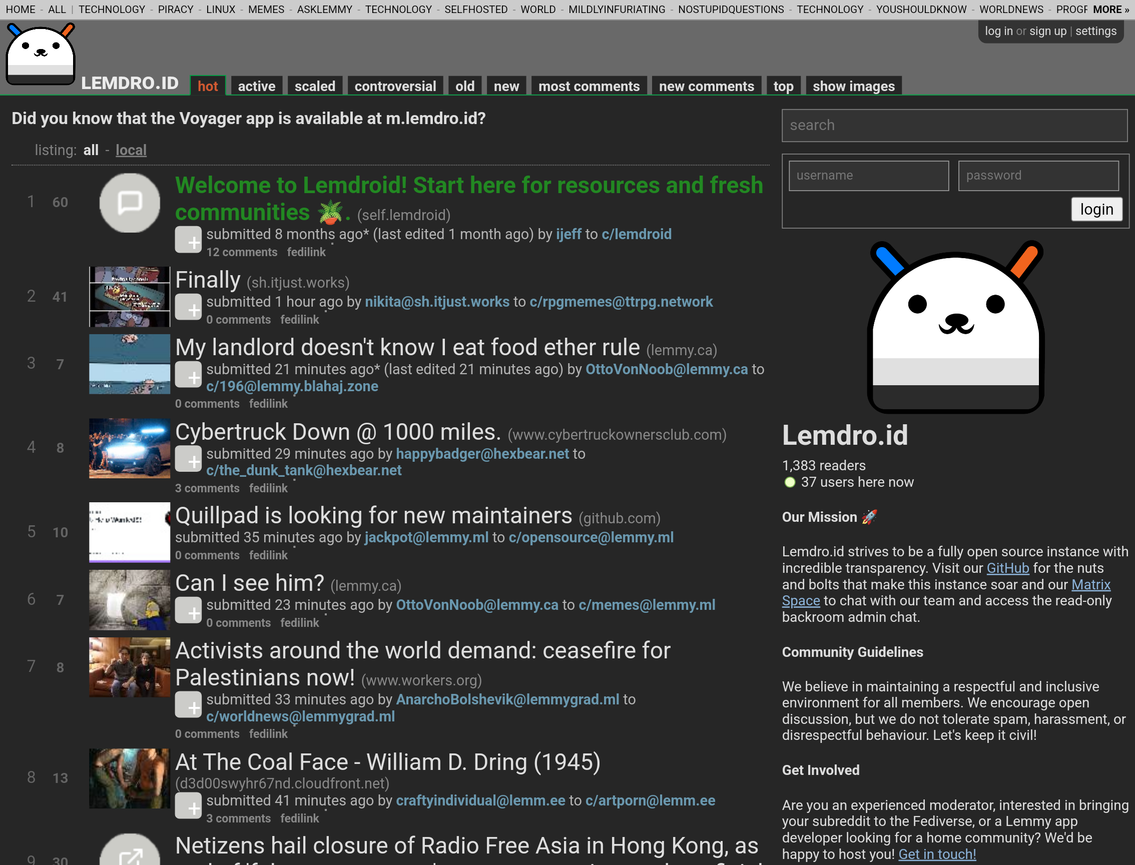
Photon Announces Revamped Design
We’re thrilled to unveil a significant redesign of Photon, the user interface for the fediverse! Since its inception, Photon has strived to make the fediverse more accessible with a user-friendly design.
Mono-Light addresses a key request from our community: increased information density. This redesign allows you to view more content at a glance, streamlining your fediverse experience.
Here’s a glance at our new design:

As you can see, every UI element has been streamlined while still remaining beautiful. You can see so much more at once, with no sacrifice to usability. Got fat fingers? just cut a bit of it off.
You can expect this new design to roll out by the end of today, April 1st.
...
No offense to the mlmym devs. Photon users want a clean UI, while mlmym users want an information dense, old reddit like UI.
