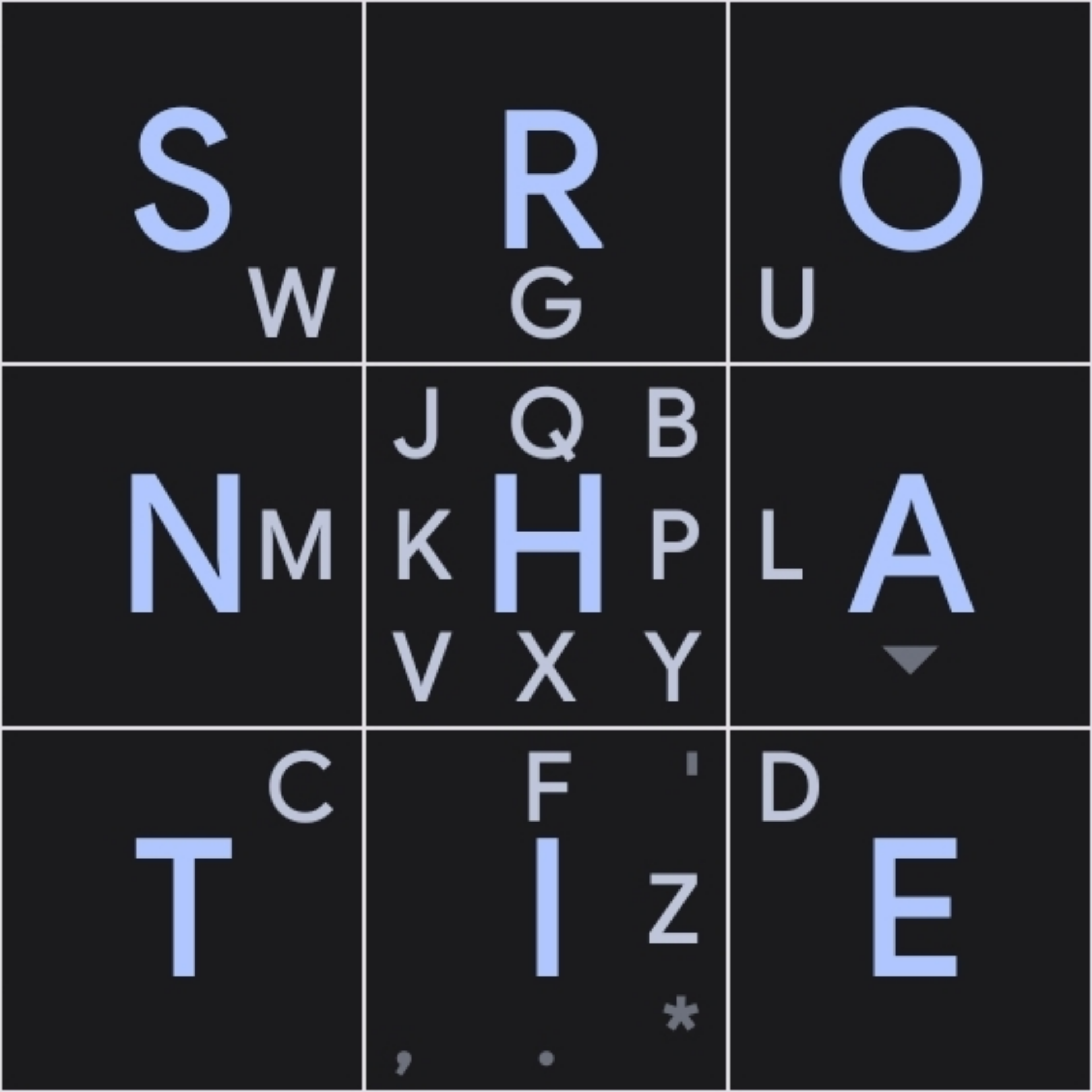
I am working on my own layout. optimized for using two thumbs to type. I put together a layout that avoids a lot of common bigrams on the same thumb, but I’d love some feedback/critique before submitting it. (this is a mockup in a different app, but its swipe detection sucks and makes testing hard)
Some notes/things that aren’t clear in the image:
- swipe up on o to paste
-
for numbers and special keys (swipe right for next layout. up for settings)
- swipe up space to capitalize next char, swipe again to caps lock, swipe down to lowercase
You must log in or register to comment.

