

They’re making a broader audience oriented trailer with fake player reactions to appeal to people, and I’m guessing we’ll get the adhd induced usual trailer later (or not idk) but that’s not the point I want to make
I know it’s a super niche concern but I noticed in the new sponsors system and also ui rework videos that they’re handling fonts really weird for this new season, I don’t know why they’re giving up on their main font Saira (and its condensed variants) but you’ll notice there’s a new font that’s a lot more bland and placeholder-y
Here’s a bunch of screenshots :
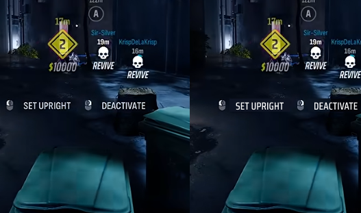
From Gameplay Trailer, "default" looking font vs what it could look like with Saira "The Finals" Font
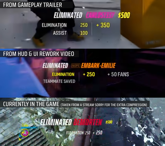
Different type treatment for scoring, I don't know which one will ship with the new season
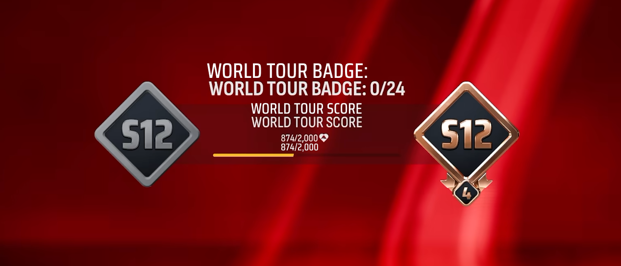
Weird new font for World Tour progression with the actual Saira "The Finals" font for comparison (from NEW SPONSOR JOURNEY video)
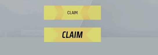
Super tiny claim button vs what it could look like with the proper font and bigger text
Idk I’m not claiming to be better than embark, maybe they had to rush work and did not have the correct footage, I just noticed these kind of weird inconsistencies, I hope they stick to the signature font cause it looks very good