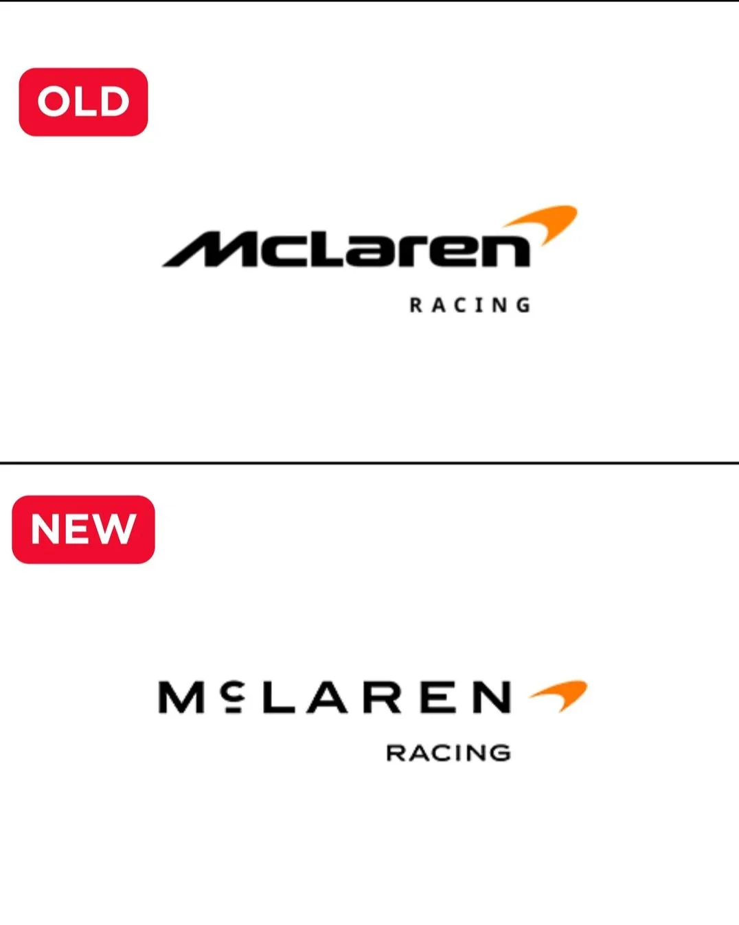

Ugly. It looks like they sell over priced soap.
Damn it looks terrible. What a fucking useless endeavor, to change such a good brand
Graphic design has peaked and gone to shit.
I wonder how much was spent on just changing the font
about 10,000 tokens
It’s just awful. Why did all design go to hell.
Gosh, what’s up with logo design being so bland nowadays?
That’s absolutely horrible.
This really feels like the IBM logo having white lines through it to make it easier to photo copy in the 80s.
Only now it’s “the AI can’t generate our logo”, “well what can it generate, we’ll just use that”.
It’s giving opthalmologist/eyewear/glasses shop.
It’s neat they’re using the old petrol station logo the McLaren family ran back in the day but I dont like it as much as the one its replaced. As I saw someone else online say it just doesn’t look as fast and feels less fitting.
Ugh, I thought we were done with this stupid trend…
Looks more like one of those countless bland luxury brands now
Someone got paid 6 figures for this…
It honestly looks like a g
MgLaren
That’ll catch Kimi lmao