
An article by Peter Cho
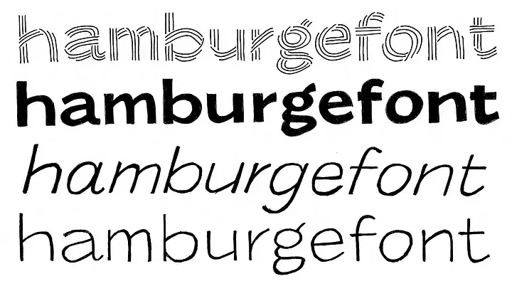
This month I launched my first typeface, hopefully the first of many. It’s called Peasy, and it’s a low-contrast humanist sans type family that works well for setting long-form text. Peasy was my thesis project from my type program, and to be honest, the name came first.
The project started with a few original inspirations — one was making something “easy” — clean, easy-going, a font I would want to use myself. Another was the idea of modular, multi-color type. Here I explored ideas for stencil and multiple stroke inline styles.
You must log in or # to comment.