

The logo of Starbucks is widely recognized, yet its origins are often misunderstood or misrepresented. At the center of the design is a two-tailed siren, a figure drawn from European maritime folklore rather than any ancient Near Eastern religion. Sirens, in myth, were creatures of the sea known for their ability to lure sailors with irresistible songs. Over time, especially in Northern European art, they came to resemble mermaids and were sometimes depicted with two tails, which allowed artists to create symmetrical and visually striking compositions.
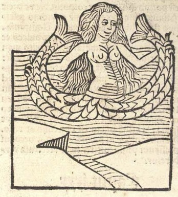
When Starbucks was founded in Seattle in 1971, the company’s creators deliberately chose imagery connected to the ocean. Seattle’s identity as a port city and coffee’s long history as a traded commodity influenced this decision. The founders found inspiration in a 16th-century Norse woodcut of a twin-tailed siren, which carried the sense of mystery, distance, and allure they wanted the brand to embody. The company’s name itself also reflects this maritime theme, being taken from Moby-Dick, a novel centered on seafaring life.
The original logo was far more detailed than the modern version, rendered in brown and showing the full figure of the siren. Over the decades, it was gradually simplified, shifting to green and focusing more closely on the face to create a cleaner and more adaptable design. Despite these changes, the core symbol has remained consistent.
Claims that the logo represents ancient figures such as Inanna are not supported by historical evidence. The design is firmly rooted in European artistic tradition. Ultimately, the Starbucks logo is not a hidden symbol but a deliberate, stylistic choice tied to maritime history and global trade.