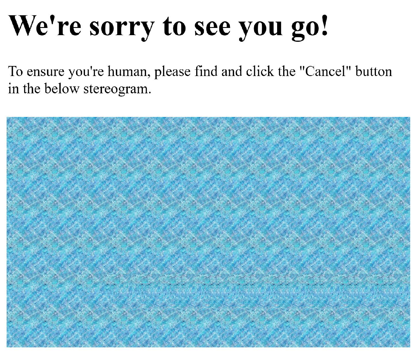
Ironically, the word “CANCEL” is much easier to read in this instance if you cross your eyes. The button is recessed, and the word is level with the rest of the image if you cross your eyes. If you view this image the normal way with diverged eyes, it becomes super hard to read.
There are also a lot of JPG artifacts messing it up. Just look how poor the button looks when the layer is duplicated, shifted, and put in difference mode:


Yeah, you’re supposed to look “behind” the image.
Ironically, the word “CANCEL” is much easier to read in this instance if you cross your eyes. The button is recessed, and the word is level with the rest of the image if you cross your eyes. If you view this image the normal way with diverged eyes, it becomes super hard to read.
There are also a lot of JPG artifacts messing it up. Just look how poor the button looks when the layer is duplicated, shifted, and put in difference mode: