
An article from Jan Nikka A. Estefani
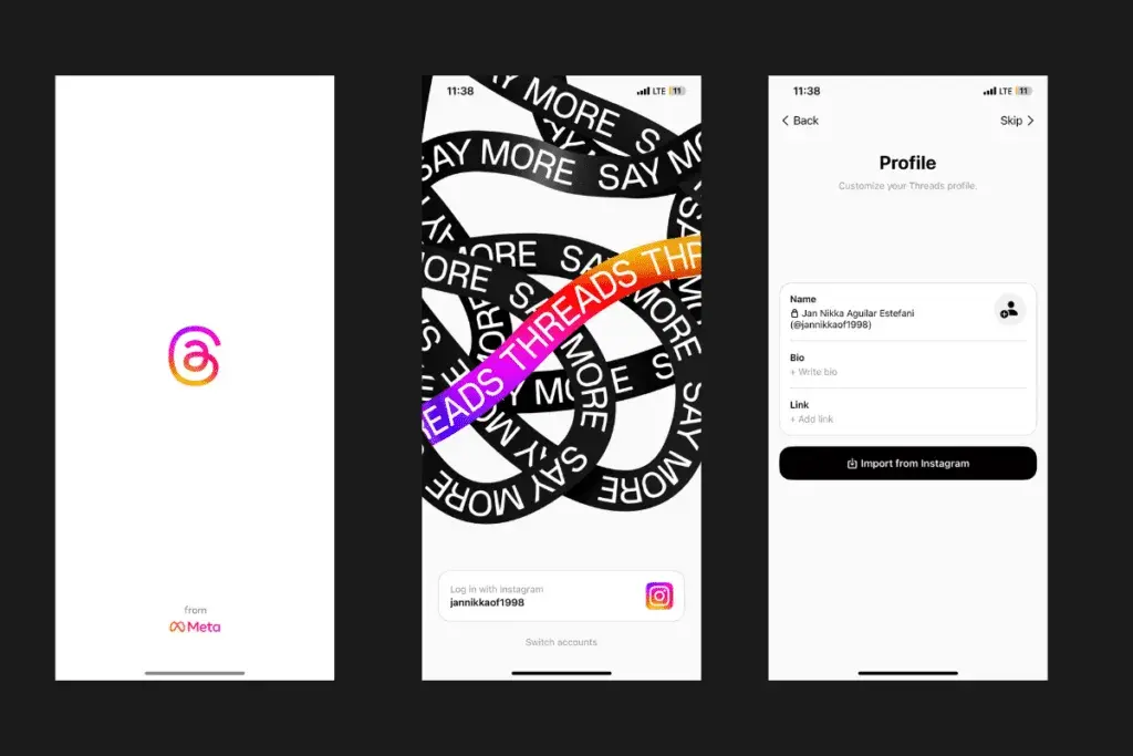
In the vast landscape of messaging apps, Threads App has emerged as a standout platform, focusing on streamlining conversations and fostering meaningful connections. Its user-centric approach and seamless design have garnered widespread attention. Threads achieved an astonishing feat by reaching a high amount of users in just 5 days after its launch.
This unprecedented success can be attributed to its innovative features, word-of-mouth recommendations, and strategic marketing campaigns that captivated the interest of tech enthusiasts and casual users alike. The app’s ability to cater to diverse communication needs while maintaining a simple and intuitive interface contributed significantly to its rapid adoption by millions of users worldwide.
In this detailed article, we will explore the key aspects of Threads App’s UX/UI, from the onboarding process to the application of UX and UI principles, while also discussing potential issues and concluding with an overall assessment of the app.
To contrast with the statements above, this article from Kyle Barr is also an interesting read : https://gizmodo.com/threads-has-lost-more-than-80-of-daily-active-users-1850707329