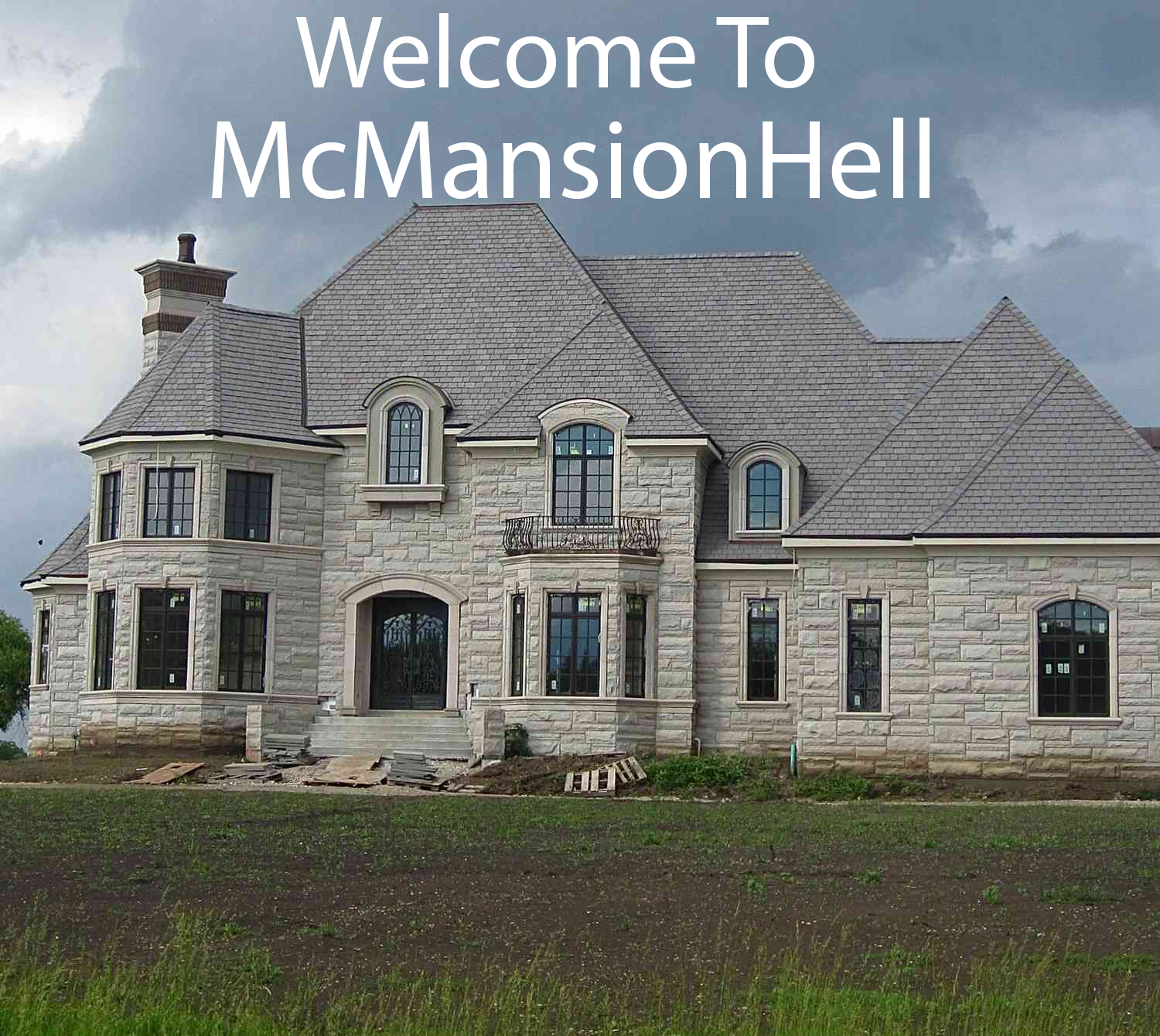
I sort of love it. It’s like a baby bird, ugly in a naked pink funny way while making completely terrible decisions, and you can’t help but find it pitifully endearing.
The people who made this had no taste or design skills, the whole place looks like it’s having an identity crisis. And no amount of the most expensive fittings and materials in the catalogue is going to conceal that cheap construction.
I am hypnotised by the paint effect walls and completely clashing furniture, fittings and lights. Just really bizarre choices all around, you think you’ve got their themes figured out and then suddenly there’s a green marble fireplace or partially brass bathroom partitions or suddenly the cornice just stops.
The living room even has that typical American arched doorway
And yet the one right next to it… doesn’t. There is just nothing that matches anything else, it’s impressive in its own way.
What do people hide in these sorts of houses? Is it the whole, multi-generation family? Also, does the bridge have one floor or 2 floors?
I had 2 clients in McMansions during my time as a custom integrator and they were indeed multigenerational homes. The basement in one was basically another full house - 3 bedrooms and 2 baths with a separate entrance. And a theater, of course. The elderly parents lived down there.
The difference between these houses and the actual mansions I worked in were staggering. They sound as hollow as they look… Every room had bad reverb and there was no isolation between rooms. Surround sound speakers on 14ft ceilings…why. Every wire was the lowest grade cat5 you could buy - 4k over IP was not happening. Not to mention how much of it wasn’t to code.
Weirdly both clients were awesome people who tipped extremely well.
Interesting!
Another thing that drove me crazy…the “high end” architecture was also hollow. Like very nice cabinets but using 1/2" wood instead of 3/4" so they flexed if you leaned on them. They feel like movie sets.
I suppose that is, in a way, what they are supposed to be – displays of wealth by people who can only just afford them which means they have to spare on the quality
The weird part to me is that they’re only impressive from the street…but they’re usually in private communities full of other McMansions…so…who are you trying to impress? Other people who know the truth that your house is made of toothpicks and paper?
Hmm that is puzzling
All that marble, the high ceilings, and lack of internal doors makes me think this place must echo so badly.
That’s quite the roofline. Looks like you could put two more floors of living space in the attic.
not to mention the random angled chimneys.
This threw me way off…like MC Eschers Chimneys…is one or two on the portico? Then there is one behind a gable and then in front of another gable…this hurts my brain
The fireplaces are nice. That is the only good thing I have to say about it
Needs more chimneys
Needs more taste, less money


